


Landing Page Optimization: 10 Simple Steps For More Conversions
When a visitor knocks on your front door and you open it, what are the first things they see in your home? Is your house inviting? Is it aesthetically pleasing? Does it make them want to walk through and see more? Landing pages offer a similar first impression to our websites. They are the first glimpse people receive about our brand, our product offerings, and our standard of service. Because of these factors, landing page optimization is key.
10 Lessons in Landing Page Optimization
57% of B2B marketers say conversion rate is the most useful metric for analyzing landing page performance. But how do we know which aspects of the page need the most improvement? There are many individual aspects that contribute to a converting landing page, so let’s breakdown the ones you should focus on most.
Here are the best practices for optimizing your landing page and achieving your conversion goals.
#1 Outline Goals
What objective are you aiming to achieve? Are you trying to add subscribers to your email list, or get consumers to download a free ebook? Understanding the goal of your landing page is imperative to its success. If you’re shaky or unsure on this, the page’s quality will reflect that.
Consider this landing page for term life insurance coverage.
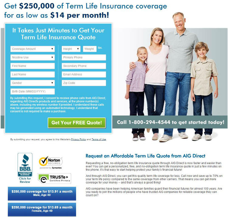
Notice how the goal of this page is crystal clear? They’re not trying to outright sell you on their service, they’re merely offering a free quote. If their focus was any broader than that, it probably wouldn’t convert.
In addition to your content, it’s also important to consider specifically which metrics you’ll be tracking. Are you focusing on the number of visitors who make it past your landing page? Or simply the total number of conversions? In the above example, there are two clear micro conversions. The first is to collect email addresses to build an email list, and the second is to collect zip codes for location targeting.
Here’s another example, this time marketing a WordPress landing page plugin. Yes, it’s a landing page about landing pages.
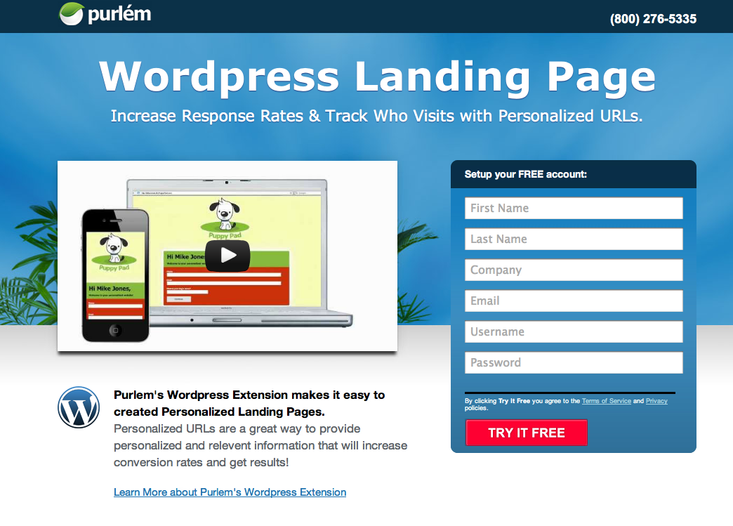
The goal here is to get people to create a free account. “Free” is the effective word, as it’s mentioned at least 3 times on the page, limiting the perceived risk factor of signing up.
Remember, landing pages aren’t directly about making a sale, they’re about collecting pieces of information from your leads to help drive them through your funnel. If you’re working at an agency, consult your sales team to determine which pieces of information they need to collect.
Once you’ve narrowed your goals, it’s time to start building the page itself.
#2 Fast Load Times
The name of the game is speed. Studies have shown that a one second delay in page response can result in a 7% reduction in conversions. Thinking of that stat monetarily, that’s a $7,000 loss for every $100,000 in revenue. Ouch. Thankfully, there are many ways we can improve our load times to prevent this type of hit to our ROI. And it doesn’t require a master coder to make it happen.
The most effective way to speed up your landing page is by streamlining the number of on-page elements. Without getting overly technical, this is the process of reducing the number of places that your site has to go for information, including images, Flash content, and stylesheets.
Enabling browser caching is another way to decrease the amount of places your site has to go, by storing the elements of your page on a visitor’s hard drive. This doesn’t benefit first time visitors, but it will increase load times for repeat visitors.
Images and media content are another tremendous burden on your page load times. As we’ll discuss next, there are ways of compressing this content without compromising quality. To check your sites speed, use Google’s Speed Insights tool.
#3 High Quality Images
Visual content is an increasingly important factor for driving conversions. But while high mega-pixel images look fantastic, they aren’t so fantastic to our page load times. This is why compression is key, just so long as it doesn’t turn our images to mush.
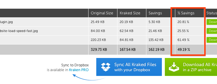
My favorite compression tool is the Kraken image optimizer because a) it compresses your images by as much as 80%, b) it’s available as a WordPress plug-in, and c) it’s inexpensive. You can start out with a free account to make sure Kraken is for you, and after that it’s only $5 per month. Most importantly, your image quality is NOT sacrificed in the slightest.
Kraken also allows you to crop images by length and width, similarly to Photoshop.
The notion of high-quality images doesn’t only mean pixel-wise, it also means images that are effective at converting. Let’s look at a landing page that qualifies individuals for treatment of excess chin fat.
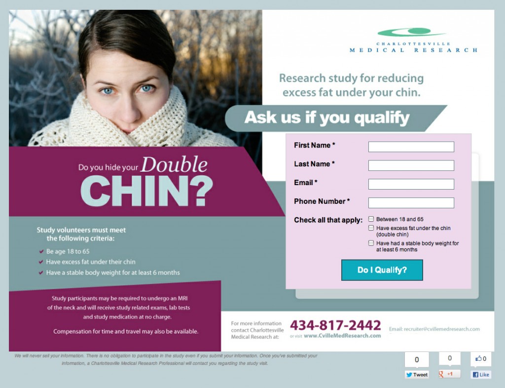
The picture of an actor wearing a protective scarf around their chin is an effective sales pitch for the product, especially when paired with the caption, “Do you hide your double chin?” This landing page uses this powerful image to illustrate the vulnerability of visitors who suffer from that issue.
As far as choosing an image file type? This is a question that many new brands and marketers struggle with, especially when they’re still doing all the photo editing themselves. It might seem overwhelming at first when you go to save an image and are confronted with a bunch of image types. Just know that in most cases JPEG is your best option, due to its small size and quality preservation. Next up would be PNG, although these tend to be much larger files. And finally, there are GIFs. But don’t use GIFs unless your image is really small (somewhere in the 10×10 or 20×20 pixels range).
Try to limit the amount of images you use in general. At most, use only one or two images on a given landing page to avoid clutter, focusing on quality rather than quantity.
#4 Contrasting Color Schemes
A dull, uniform, cookie cutter page is less likely to convert. Visitors respond better to contrasting color schemes, especially layouts that differentiate background color from text color.
Let’s take the following example:
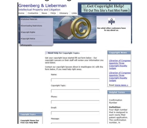
This is undoubtedly the landing page of yesteryear, back when drab was in. It has all the warmth of an IRS tax form with a color scheme to match. Not a very compelling page, even for the most interested visitors. Even if the law firm is fantastic, this landing page isn’t going to help them get new clients.
Now let’s compare that to another possible landing page for a law firm:
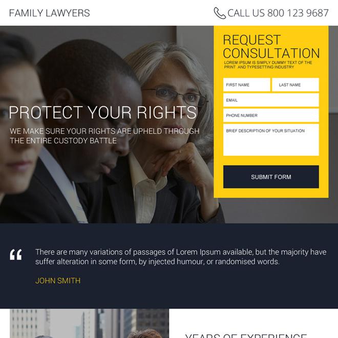
Granted this is only a template, we can plainly see how it exceeds the quality of our first example. If the previous law firm had used this type of engaging color scheme it could dramatically improve their conversion rate. While each of these pages asks the visitor to fill in some basic self-identifying information, the latter page excels in two areas: a) it immediately draws one’s attention to the form by placing it within a bright yellow box, and b) it requests only the most pertinent information to be entered, which will make the visitor feel more at ease so that they aren’t giving away too much right off the bat. The second landing page makes its intention clear, it wants you to sign-up for a consultation. They aren’t coming right out and saying they want to take your case, and they aren’t cramming a bunch of unrelated legal advice down your throat to confuse you. Through simple landing page copy and a contrasting color scheme, this second example is begging to convert.
#5 Elaborate on your PPC ad
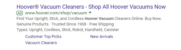
For those of you using PPC campaigns to guide users to your landing page, make sure the ads match up with the content on your page. If users click on an ad that’s selling vacuums but are sent to a landing page that discusses a whole host of other cleaning supplies, they are much more likely to bounce. In this scenario, your landing page needs to be all about vacuums.
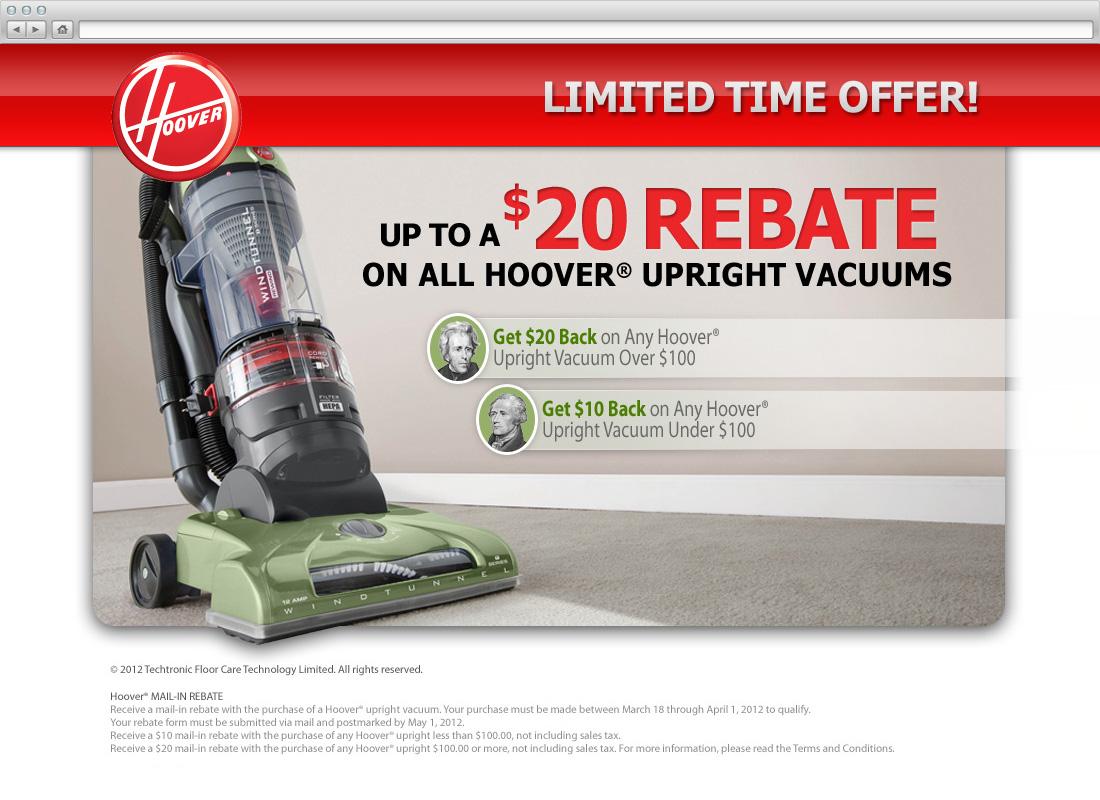
Hoover not only makes their offer crystal clear, but they sweeten the pot with a $20 rebate. Which, by the way, is done using a much larger font than the surrounding text (which we’ll talk more about coming up).
PPC advertising is obviously a very effective way to get consumers onto your landing page. But just as you would create multiple ad campaigns, you also want to create multiple landing pages that correspond to the ads. This point can’t be overstated, as companies see a 55% increase in leads when increasing their number of landing pages from 10 to 15.
“Does that mean I have to split test multiple landing pages? Yikes.” Fear not young marketer, there are a number of great A/B testing utilities you can summon for the job including Optimizely, or for free using Google Analytics. It takes time to find the right pairing of PPC campaign and landing page, but trust us when we say it’s going to be well worth the wait.
#6 Make Call to Action Clear
The Hoover landing page we showed above has a clear call to action. It’s a “limited time offer” for Hoover upright vacuums and features a “$20 rebate.” While this is a perfect example of using scarcity to compel visitors to want to make a purchase, it isn’t necessarily the right message for your landing page. The goal of a landing page isn’t always about immediate purchases; most of the time it’s meant as a vehicle to strike up relationships between potential leads and your brand.
But whether your goal is to get consumers purchasing products right away or it’s merely to have them sign up to your email list, your call to action is everything.
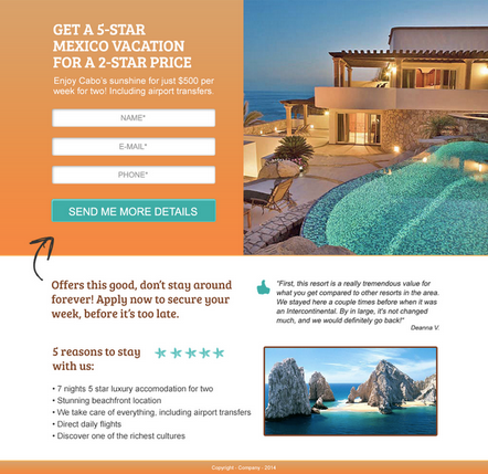
“Get a 5-Star Mexico Vacation for a 2-Star Price.” Talk about a call to action! Promising a luxury vacation experience for a fraction of the cost is one way to build an email list quickly. Because the call to action is so clear and engaging, the only details the landing page asks for is the visitor’s name, email address, and phone number. Understanding that people are craving more information from that exciting call to action, the page smartly has them click, “Send Me More Details.”
Whatever product or service you’re marketing, focus on making your landing page a value proposition. Incorporate the secondary benefits of the offering along with the key benefit to help draw the clients in. For our Mexico vacation page example, the key benefit would be the quality of the vacation that customers are getting for the price, and the secondary benefit would include the information underneath the section “5 reasons to stay.”
#7 Use Effective Headlines
David Ogilvy said it best, “On the average, five times as many people read the headline as read the body copy. When you have written your headline, you have spent eighty cents out of your dollar.”
It’s true. Consumers don’t want to take the time to read through an entire article, so most just skim the headline and make a value judgment right then and there on your product. Because your headline carries so much value, you need to write one that’s value-centric. In other words, ask yourself what the inherent benefit or value is of your product, and determine the best approach to take from there.
Here’s a great example of ad copy that resonates. Take a look at the landing page for this weight loss program:
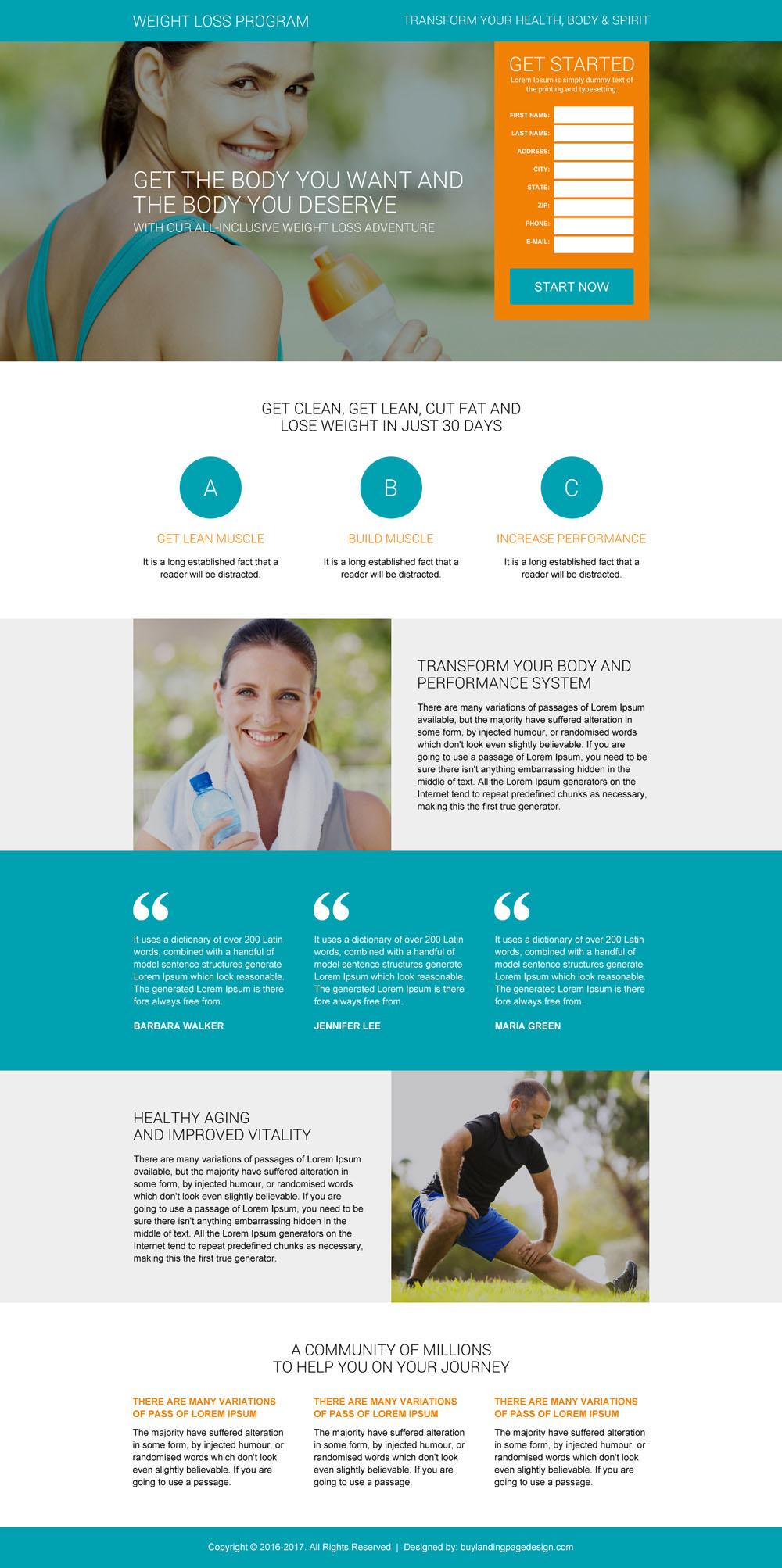
“Get the body you want and the body you deserve.” This copy explicitly claims that the product will give clients what they want, which is to lose weight. But it does something far more significant. It assigns a sense of self-worth to the client, telling them that they DESERVE to have a slimmer, healthier body.
Compelling copy isn’t as easy as throwing a sentence together like, “Order my product today.” The job of a marketer is to put themselves in the shoes of their clients, understanding the problems they face and approaching the solution from an perspective of empathy.
There’s also the factor of time. Because people tend to bounce from landing pages fairly quickly, you only have a few short seconds to convince them to opt-in to your product. This means that your headline has to be totally clear and convincing, not ambiguous and roundabout. It’s sort of like auditioning for a play. If you only have one chance to make the right impression on the director or playwright, you wouldn’t start reading a scene from a different production. Don’t blow your opportunity to generate conversions by using a poor headline. Bring the point home right away.
Let’s look at a few more examples:
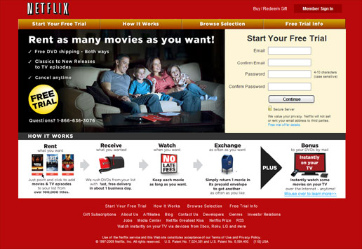
Here’s Netflix’s landing page circa sometime in the late-2000’s. This page is interesting in a couple of ways. Firstly, it’s amusing that Netflix was specifically marketing DVD rentals back then. But for the sake of our landing page analysis, let’s focus on the ad copy. It’s exemplary! “Rent as many movies as you want” sums up the Netflix ethos in seven words. If you recall at the time, movie rental stores placed significant limits on the quantity of DVDs a person could rent. Netflix saw this market deficiency and aimed to solve it, by abolishing those limitations and revolutionizing the industry. It was landing pages like this that turned Netflix into a multi-billion dollar company, and this kind of ad copy played a monster role in the conversion process.
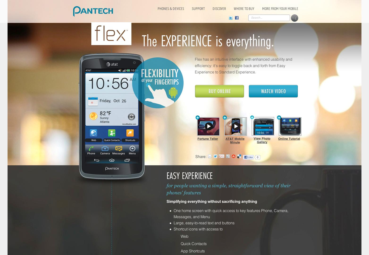
Initially, I couldn’t tell what product this landing page was marketing, but upon further review, it’s clearly a tool that consolidates everyone’s iPhone information in an easy to manage interface. “The EXPERIENCE is everything” makes it sound like the manner in which you view your phone is the most important thing about your phone. This is a perfect message for the consumer base they’re targeting—individuals who are less tech savvy than most smartphone users.
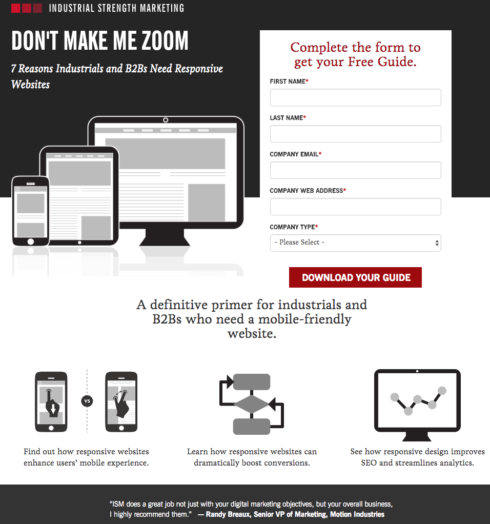
The perfect headline for a B2B landing page that’s marketing responsive website creation: “Don’t Make Me Zoom.” Anyone who works in digital marketing or runs a website can chuckle at it. Sometimes it pays to infuse a humorous tilt within your ad copy, especially when you’re selling to fellow marketers. In fact, many of them would be turned off by a lot of B2C headlines because they’ve heard it all before.
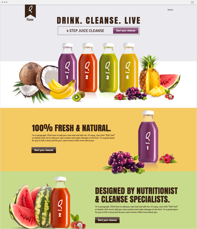
This one’s a little different from our other examples. Yes, there’s still a clear headline on the top reading, “Drink. Cleanse. Live.” But the landing page is divided into three sections, each with a new headline. We’d call these 2nd and 3rd level headlines. They can be effective at helping you break up the central topic of your landing page and offer the reader more substance for informing their decision. In this example, while the 1st headline is somewhat effective, it demands some elaboration. The 2nd and 3rd headlines help inform customers that these juices are completely natural, and they are designed by nutritionists. In other words, people won’t have to worry that the juice was developed by some guy in his basement.
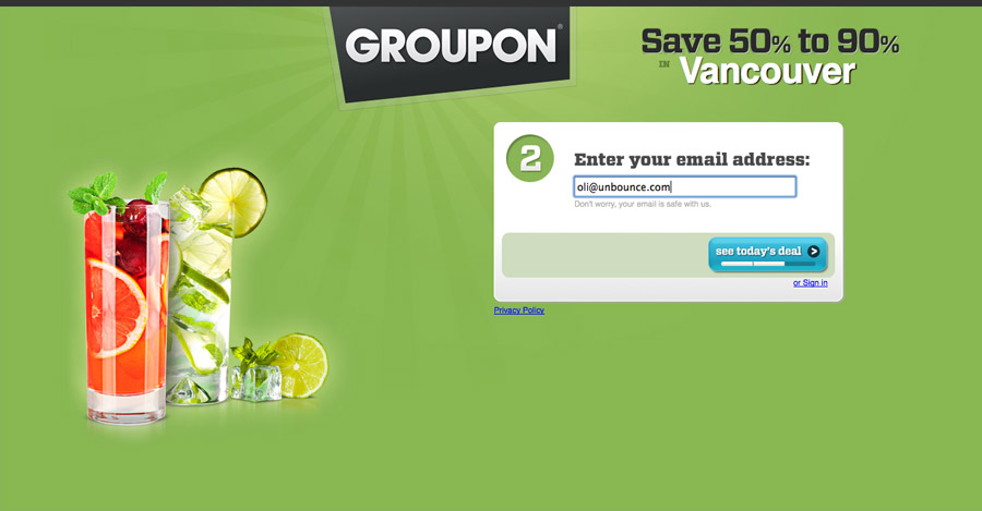
There’s just so much to love about Groupon, including this landing page. The copy, “Save 50% to 90% in Vancouver” just speaks so effectively to everyone’s penny-pinching instinct. It’s really all that needed to be said on this landing page. When it’s paired with the enticing “see today’s deal” button, it’s a hard landing page to resist. For anyone out there who’s into affiliate marketing, Groupon is your best case study on things you SHOULD do. When you’re trying to market your affiliate products, it’s always effective to claim that you can save consumers a certain percentage off the regular purchase price.
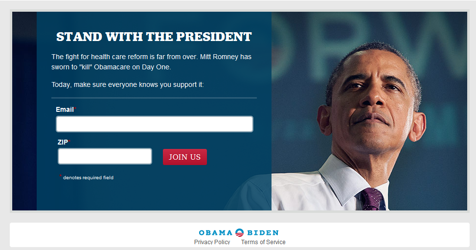
This landing page that was aimed to galvanize support for President Obama’s health care reform was quite successful in doing so. The headline “Stand With The President” evoked an emotional response from supporters of the issue, and the email list numbers quickly skyrocketed.
Psychology majors have a knack for writing compelling landing page headlines because they know how to elicit an emotional response from people. But they aren’t the only ones with this skill, you can do master it too. There are plenty of helpful copywriting resources around the web, including from Copyblogger, The Gary Halbert Letter, and anything from Kissmetrics.
#8 Shorten Lead Capture Form
Maybe “shorten” isn’t the best word to use here, let’s go with creating “smarter” lead capture forms. In other words, you want pages that take up just the right amount of space to get your point across but not too much space that your point becomes muddled. Although longer lead capture forms can lead to higher quality leads, shortening your form will generally help you build more leads faster. For a brand new business who’s simply trying to build their subscriber list, a shorter form is the way to go.
If you’re marketing on behalf of a more established brand who has a fairly large following and plenty of subscribers, your focus might shift towards gathering a higher quality of leads. This would be the time to implement a longer form that asks for more customer information.
Let’s compare a short lead capture form against a long one:
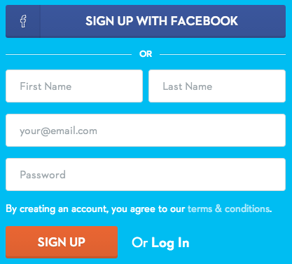
Straightforward, with only four fields of information to fill in. This short form is a lead gen machine! Now let’s look at a longer capture form.
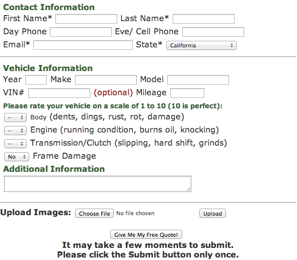
Not only are there too many boxes to check and lines to fill out, but the structure of the form is off putting. Too cramped. Not ideal for boosting leads through the funnel.
Another reason why it’s better to stick with shorter, but smarter, forms is so that you can qualify leads. This is the process of scoring each lead who opts-in on your landing page, helping you retarget specific content to them. As a rule of thumb, you’ll want just enough information from them to help you a) qualify them, and b) contact them in general. If the form is too lengthy and asks for pointless information, many potential leads will be scared away.
Another reason to have a shorter lead capture form is for keeping your call to action above the fold, or near the top of your page, rather than forcing people to scroll down in order to read it. The reason being? People on average scroll through only 50-60% of a page.If you spend hours crafting a landing page that’s thousands of words long and requires thousands of scrolls, your conversion rate might suffer.
Again, we’re not claiming that shorter lead pages are always the better option. In fact, marketing guru Neil Patel ran a test on his homepage where he took his 1,200 words of content and squashed it down to 400 words (as well as moving some forms to above the fold placement). What did he find? The original, longer form page had a higher conversion rate. Plus, it ranked better on SERPs. Never forget to follow SEO 101, which states that “content is king.”
Each marketer’s landing page requires different length requirements. A/B testing is essential to maximizing your conversion rate and getting higher valued leads.
#9 Add More Landing Pages
It’s no secret that the number of landing pages has a drastic impact on garnering more leads, but how great is that impact? Looks to be subtle, until we get to the 20 and above mark.
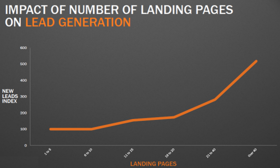
Source: Hubspot
Once we surpass 20, the results are magnificent. You’re looking at about 200 more leads for every 10 new landing pages. This is a beautiful thing because it allows your creativity to soar, giving you the ability to test new headlines, body copy, calls to action, images, and placement of forms.
It gives you more data to pour through in Google Analytics, or another analytics tool, which you can then use to segment your audience for optimized targeting. This segmentation can occur by organizing your buyer personas into specific audience interests groups depending on how they responded to your landing pages.
#10 Use a Landing Page Optimization Tool
Knowing the best practices to optimize your landing pages doesn’t mean that you can do it alone. And when you’re looking at anywhere from 30-45 landing pages, well, forget it. Thankfully, there are a multitude of wonderful tools to help us improve our pages without having to call in the world’s top senior web designers on a moment’s notice.
- Unbounce
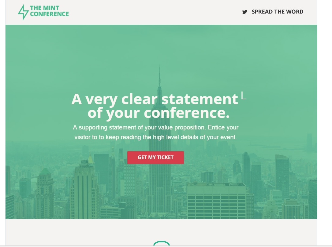
A great optimization tool for small businesses, Unbounce costs only $79 per month while allowing you to create 75 landing pages and work with 8 overlays. There’s no real need to purchase a more expensive package, as this basic one gives you access to plenty of incredible landing page templates. My favorite is the “mint” template:
- Optimizely
For those looking to just get their feet wet with an optimization tool, try Optimizely. The tool allows marketers to use a Pay As You Go system which costs $49 for every 1,000 monthly unique visitors that they test. Basically, you only have to pay for the stuff you use, which can be a great thing for brands on a budget.
- Crazy Egg
Neil Patel’s company offers a lot for marketers looking to dig deep into the analytics of their landing pages. While most of the information is accessible in Google Analytics, the visual layout in Crazy Egg is a sight to behold. Where else can you see a heat map of which elements on your page leads are paying the most attention to?
This map alone can tell you whether your headlines, CTAs, and images are effective.
- Wordstream Landing Page Creator
Earlier we talked about the importance of keeping your landing page consistent with your PPC ads, and Wordstream is here to help with that. Their Landing Page Creator tool lets you sync your page content to the specific PPC ads they serve, and helps you balance the quantity of data fields required for your visitors to fill out and convert.
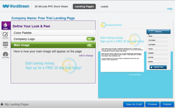
It’s a great tool for creating multiple landing pages that need to follow a particular theme. Wordstream doesn’t come cheap at $264 per month, but for medium- to large-sized businesses it provides the resources needed to execute consistently effective PPC campaigns that tie together perfectly with your landing pages.
Keep Testing
Never stop testing. That should be a t-shirt, if it isn’t one already. Cracking the code for boosting conversions is a never ending process, and just when we think we’ve fully optimized, low and behold it’s time to start testing yet again. Landing pages are especially tricky because there are so many factors at play: images, headlines, copy, calls to action, and form length all play an important role. Through your understanding of the best practices, combined with using a helpful landing page optimization tool, you should be well on your way to finding better qualified leads and boosting your conversion rate.
