


Internal Linking: The Biggest Dos and Don’ts
Internal Linking
Internal linking is an easy and handy tool that can do a lot to improve your site’s user experience (UX) and search engine crawlability. Just by adding the appropriate links on your various pages, you can help ensure you establish a hierarchy of information that makes your site maximally visible to search engines and helps your users navigate the site in a logical, user-friendly manner.
What Is Internal Linking?
Internal linking is the process of adding links that direct from/to content on the same domain. Essentially, it’s a hyperlink that lets a user navigate between pages on the same site.
(This process is distinct from backlinking, wherein a hyperlink directs a user from one site to a different site.)
Why Do Internal Links Matter?
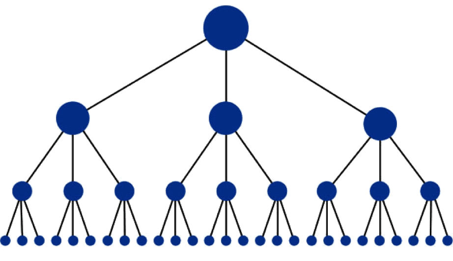
A visual representation of the ideal linking structure within a site. Image courtesy of Moz.com.
Internal links accomplish a couple imperative things:
- They facilitate a user’s ability to easily navigate the site. Improved UX can lead to more favorable impressions of that site and increased likelihood of sharing content and/or purchasing the service or product offered.
- They establish the site’s information hierarchy. That is, the link system can point to what information is most vital.
- They distribute ranking power throughout the site.
- They help ensure search engine spiders can actually find all your pages of content to crawl and index. You can have the most engaging content ideas created with the ideal keyword research, but none of that matters if the crawlers can’t find your pages to index.
The “Dos” of Internal Links
When you’re establishing your internal link structure, there are some tips and techniques to keep in mind:
- The linked text (also known as “anchor text”) should be descriptive.
You don’t want your user having to guess about what information the hyperlink will direct to. Be clear and focused in this regard.
- The anchor text should be accurate and/or honest.
A hyperlink is in many ways a promise. The link promises your users additional or supplemental information around that descriptive term. If the link directs to a page that is not relevant, that contributes to a negatively impacted UX.
- The linked term should be short.
It gets a little subjective here. In the same way there is no ideal length for content, there is also no universally agreed upon length for anchor text. However, you do want to ensure the anchor text is short but not too short. (For more details and caveats to this rule, please see “The ‘Don’ts’ of Internal Links” below.)
In general, avoid linking to an entire sentence or including excess wording in the hyperlink that doesn’t directly contribute to the link. That sounds a bit complicated, but it becomes clearer when seen in practice.
Take the following example sentence of content: “The linked term should be short.”
Say you wanted to direct your readers to another page that talked more extensively about anchor text. To your eye, which looks more likely to encourage a user to click? (Examples below colored for illustration but not hyperlinked.)
- The linked term should be short.
- The linked term should be short.
The second example is simply more clear and direct. The user knows exactly what the link will direct to (namely, more information about linked terms). The first example is a bit ambiguous. Is it about linked terms in general? Is it about linked terms being too short? The length of the anchor text leaves that open to interpretation. The first also includes some unnecessary wordage in the hyperlink. If your intent is to educate users about linked terms on the hyperlinked page, “should be short” has little to do with that intent.
- The linked term should be in a different color than the surrounding text.
If you leave the anchor text the same color as what comes before and after it, you run the risk of your reader missing that link altogether. Especially if the link is very short, it will be incredibly easy for a user to scan right past it and never even realize it’s a clickable link. Most people prefer a noticeable blue next to black text.
This is by no means set in stone, but blue has largely become associated in people’s minds with hyperlinks. It also ensures the anchor text is still readable.
The “Don’ts” of Internal Links
Image courtesy of Portent.com.
Sometimes the best practices are those that involve avoiding major pitfalls, and internal links are no exception. With that in mind, do your best to avoid undesirable practices as they relate to internal links.
- The anchor text shouldn’t be too short (or too long).
When it comes to anchor text, there is certainly a sweet spot. As noted above, you generally don’t want to make the entire sentence a hyperlink because this can look spammy, and it also muddles the clarity of the anchor text.
However, you also generally want to avoid using a single word (especially a short word). It’s simply too easy for a user who is quickly scanning text to miss a single hyperlinked word. (This can happen even when the hyperlink is appropriately colored.)
- Don’t overdo your internal links.
An internal link every couple of sentences starts to look really suspicious to users. Even if every link is highly legitimate, you should still avoid the practice of stuffing these links throughout a page of content. Users are more attuned than ever to spam, and if anything on a site even hints at those practices, users will be gone. Fast.
Conclusion
A few well-placed internal links are a great way to impose useful structure to your site. This applies to both search engines crawling and indexing your pages as well as users naturally and organically navigating pages. Link insertion on a page is also a relatively straightforward process, so you don’t need to possess coding skills or a lot of technical prowess to reap these benefits.
